
Download Using_Mango.pdf
Graphs
Mango provides x-y style graphs for three different data types: 1) a frequency distribution of voxel values (histogram), 2) data along a line (cross-section), and 3) data along a 4th dimension (time-series). All graph windows are resizable.
Histogram
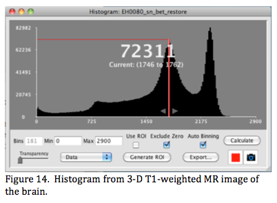 A histogram is a graph of the number of voxels within small bins plotted over a range of image values (Figure 14). When the histogram option is selected it opens a new window with a histogram graph and options for inspection and recalculating.
Histogram values are displayed in the graph area using the mouse down action to move a line (here red) across the range (Figure 14). In this figure the graph's x-range is 0-2900 and the histogram is plotted using 181 bins of size = 16. The highlighted bin ranges from 1746 to 1762, and there are 72,311 voxels with values within this range.
The graph's y-axis max is automatically set to the max number of voxels in the histogram's bins. The Min & Max x-range defaults to that of the image display settings when the histogram window is first opened but can be manually changed. The plotted histogram can be customized by altering: 1) Min & Max (here 0 & 2900) and 2) the number of bins (here 181 and determined automatically). Clicking Calculate updates the histogram. There are two other settings: 1) Exclude Zero (default setting)- done to keep the many zeros often found outside the object from setting the max y-axis display too high and 2) Auto Binning that uses an empirical algorithm to estimate a good bin size for the graph. These can be turned off if desired, but we suggest setting Min >0 if Exclude Zero is not selected.
Clicking or dragging the mouse selects and highlights a single bin in the histogram. The bin range can be expanded using the small arrows. The expanded range can be dragged across the graph to inspect different regions of the histogram. In Figure 14 there are three brain regions of interest each with a somewhat distinct peak, the rightmost peak is for white matter (~2300), the middle peak for grey matter (~1750), and the third peak for cerebral spinal fluid (~800). Voxels within a highlighted histogram range are also highlighted in the main image viewer using the same color, and 8 colors are selectable for highlighting using the color icon button. Highlighting in the image viewer is dynamically updated as the highlighted range in the histogram is adjusted (width or position). This is helpful in determining a threshold to use to define edges for regions of interest. In fact, if the range is acceptable for such clicking the Generate ROI option will make an ROI from the highlighted histogram range. ROI editing tools can be used to finalize the ROI. Histogram data can be exported as a 'csv' file for further analysis in a spreadsheet program.
As with many of Mango's analysis features the histogram can be calculated for the entire image or for a ROI. The ROI color icon in the Toolbox determines which ROI to use for histogram analysis. Clicking the ROI checkbox switches from whole image histogram to ROI histogram mode. This is especially useful in refining a roughly formed ROI, such as one traced outside the corpus callosum (CC). The roughly formed ROI is defined to exclude most of the brain but contain all of the CC (like in Figure 12). The histogram calculated for this roughly formed ROI is then used to determine a range for refining the CC's ROI.
Finally, the histogram's graph can be toggled between Data (the default), Rate of Change, and Cumulative modes. Data and Cumulative modes are most commonly used. The y-max value of the cumulative mode is the number of voxels within the histogram's range settings (excluding zeros if that was selected). The median voxel value can be estimated from the cumulative distribution as the x-value on the graph where y = 1/2 y-max (where 1/2 of the voxels are below the indicated x-value).
Cross-section
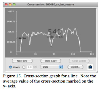 A cross-section is a graph of image values spanned by a line ROI. The graph can be plotted as data (voxel values), rate, or cumulative similar to the histogram graph. The position along the line can be displayed in image (voxels) or physical (mm) units (Figure 15). The average value of the cross-section's data is indicated on the y-axis. This graph is useful for inspecting L-R value profiles using a line spanning from the left to the right side of the object (especially in the brain).
Line ROIs are drawn at screen resolution and are redrawn to accurately track as the view or viewer are zoomed. The spacing along a line defaults to the smallest unit in the image, but can be made smaller or larger (in mm-mode) if desired. Values are interpolated for each position along a line. Moving the mouse within the graph displays positions and values (Figure 15) and dragging additionally displays a point marker on the line ROI in the image viewer. Double clicking to the left of the vertical axis brings up a small dialog window to change the vertical min-max range. As with the histogram graph the cross-section graph can be exported as a 'csv' file for further analysis. Note: The cross-section data is exported using the line spacing selected for the graph.
Multiple cross-sections are supported in either the same or different colors. The current ROI cross-section in the display is highlighted in the image viewer. The Next Line option graphs the lines in the order they were entered. Store Copy makes a copy of a cross-section graph as a black graph to compare with that from another line brought up using Next Line. Clear Copy removes the black copy of a graph.
Time-series (4-D)
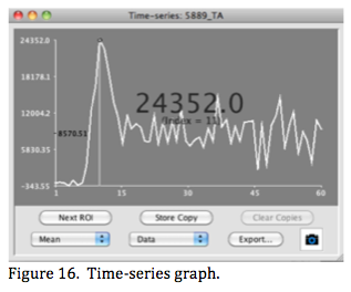 A time-series is a graph of ROI statistics for a 4-D image (Figure 16). The fourth dimension may be time (and therefore the name) or different versions of the image (such as different components from ICA analyses). Mango's time series currently uses a single ROI (point, line, 2- D or 3-D) to create the time series, so an implicit assumption is that the object within the ROI is not moving and not a different object different in different images. (A frame-by-frame ROI is under development to support studies where an object is moving (beating heart) or where images of different objects are present at each time-point (ICA components).
The Time Series option is well suited for tracking changes within an ROI when the signal is changing in time, not the object's position. This works well for nuclear medicine studies to assess organ uptake or clearance of a radiotracer. It also works well for resting state fMRIs where correlation between time series determined using ROIs placed over different parts of the brain are used to calculate region-to-region temporal correlation.
Data for the time-series graph can be the ROI mean, max, min, standard deviation, or sum. Mean and sum are the most useful when tracking the change in activity of a radiotracer (PET, SPECT, etc.) or performing region-to-region analyses. The y-axis range for a time- series graph is automatically set to maximum and minimum y-values. Double clicking to the left of the y-axis opens a dialog window where these can be changed.
Mouse position is indicated as a small circle on the graph along with time (or index) and time series value. Clicking the mouse in the graph set a vertical marker in the graph and switches the image in the viewer to the corresponding time point. Dragging the mouse rapidly across the graph window rapidly changes images in the viewer, providing dynamic viewing of the images.
Multiple graphs are supported, one for each ROI. As with cross-section graphs, a copy of a graph can be temporarily saved for comparison with another graph. All graph data can be exported as a csv file for further analysis.